
|
recent thought / activity
See the full list at LibraryThing
audio
|
what news looks like
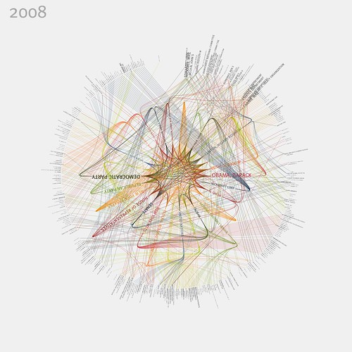
Flickr user blprnt_van has been using Processing and the New York Times Article Search API to track the occurence of "organizations and personalities" over the course of the year. "Connections between these people & organizations are [then visualized as] lines," and the mind-blowing results are below: Click on the image for a giant-sized, legible version. Information visualization edges ever closer to graphically representing something that matches my most deeply-held conception of what God looks like. Found via the Daily Clique, and indirectly through BLDGBLOG's delicious links. Labels: design, information, information_visualization, spirituality
Tuesday, February 24, 2009
two publishers
One thing that's fun about the AWP Conference I was at last weekend is that it gives me the opportunity to learn a little bit more about "who's out there" in terms of interesting writers, publishers, designers, etc. That translates into... more links for the blog! So here are two innovative literature publishers I encountered at AWP who are notable not only of the quality of the lit they're producing but also because of their excellent graphic design: Sadly, neither publisher really has a website that showcases the full extent of their careful design work. The Futurepoem catalog page, for instance, reproduces its lovely covers as undecipherable thumbnails that are only 40 pixels wide: take the time to click through to the individual book pages and you'll get a better sense of why I'd praise their graphic sensibility. [Cross-posted to the Vivarium blog] Labels: design, publishers
Wednesday, February 18, 2009
american no-place: william arnold
[This entry is part of the Production Design Blog-A-Thon, which begins today and runs through May 25th. Please consider joining us with your own post on the topic.] I wanted to begin by discussing one of the films I used for the Production Design Blog-A-Thon banners, specifically "the blue one," which features a still from 2002's Punch-Drunk Love. This film features production design by William Arnold, who has done production design or art direction for a number of notable features, including Pleasantville (1998) and Magnolia (1999). Both of these are fine films (and both would be rewarding to discuss in terms of their own production design) but Punch Drunk-Love features what I think of as his most impressive work. When thinking about the "look" of this film, many people might immediately recall Adam Sandler's blue suit, a memorable production design detail indeed, but what I really want to talk about is Arnold's skill in capturing the "look" of certain types of undistinguished everyday environments. I call the aesthetic at work here "American No-Place," and once you start being attentive for it, you can see how accurately Arnold has nailed it: No-places can be our workplaces: or the places we shop: or even our homes: —and yet it's easy tune out these kinds of places, simply because of their genericness and their lack of beauty or visual interest. That makes them all the more difficult to recreate with significant accuracy, and yet in this film, Arnold succeeds at this task unerringly. For this reason, he has earned our salute. Next time: Aline Bonetto. Labels: design, media commentary, spaces
Monday, May 19, 2008
recent visual output
Over at Flickr, my "Mold Patterns" set has been updated with a few photos of a revolting / magnificent spore colony in an old thing of leftover soup; the "Notebook on Cities" and "Notebook on Entropy" sets have also seen some activity. And I also thought some of you might enjoy seeing some of my recent stabs at the art of poster design. As you can see, I'm all about the yellow lately: Chicago-area residents who love the drone may want to note that the show the first poster is advertising is still yet to come. Labels: design, output, personal, photography
Tuesday, April 03, 2007
| |||||||||||||||||
|


